Interview with Brett Yasko
by Julie Sokolow
It is hard to leave the house without running into Brett Yasko’s design work. From Pittsburgh Love Stories on bookshelves, to the building facade of Conflict Kitchen, to the gallery guides and exhibition walls at the Carnegie Museum of Art, Brett’s work is a major contributor to Pittsburgh’s identity. Now, his discerning eye can be felt on the east coast too. Just this past October, he was appointed the Director of Design at MASS MoCA.
Brett’s work has been recognized in exhibitions such as AIGA 365 and 50 Books, 50 Covers and written about in publications and websites including Communication Arts, Print, How, the New York Times, The Nation, Metropolis, Dwell, Good, Azure, Fast Company, and NPR. When he is not producing work, he can be found teaching at Carnegie Mellon University’s School of Design.
We are incredibly honored to have Brett as a judge for our upcoming Healthy Artists Movie Poster Exhibition. We got a chance to prod him a bit on the age-old “What is art?” question, learn about how he approaches personal projects versus designing for major clients, and pick his brain about the intersection of art and politics.
 Duncan Campbell exhibition guide.
HEALTHY ARTISTS: Let’s start with your “a book a year” series. What inspired the series and how did year three’s project, Shiv, find its way to you?
BRETT YASKO: I started “a book a year” when I first went out on my own as a kind of self-promotion. I wanted to design books for a living so I thought it would be cool to design a little book each year around the words of a Pittsburgh-based writer, writing something that related to Pittsburgh in some way. And then I would send them out to people I work with or want to work with as a little “remember me” present. Each one I’ve done has led to something really good and each, in a different way.
Shiv came from my friends Chris Kasabach and Vanessa Sica, both terrific industrial designers. Before Chris married Vanessa, he had a girlfriend whose father worked as a guard at Rahway State Prison in New Jersey. One day he was telling Chris about all these prisoner-made weapons — shivs — that they would confiscate and keep in a big bin. Because Chris was an industrial designer, he was really interested in this and asked his girlfriend’s father if he could get him some to look at. The father said no, no, that would be illegal. A few weeks later, a box without a return address showed up on Chris’s doorstep and inside were 11 shivs. When I heard this story, I immediately said: “That’s the next book.”
 SHIV.
SHIV.
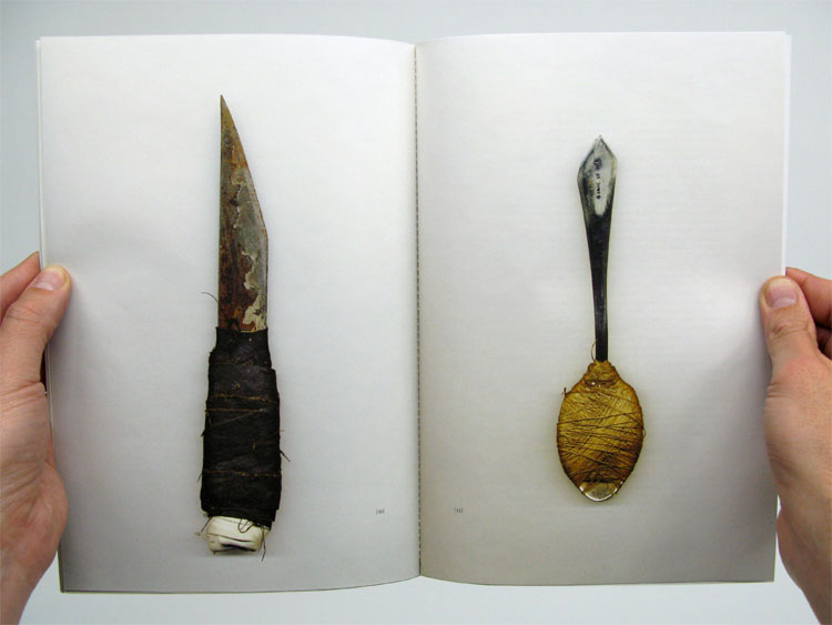
I decided to simply scan the shivs and print them as actual size — so the reader could sort of get the idea of what it would be like to put their hand around each one. Shiv has been the most popular book in the series. I only have a few left, actually, because people from all over the world have asked to buy a copy. I’m really excited about the next “book a year”–a collaboration with journalist, Aaron Jentzen. It’s about the band Wild Cherry and their song “Play That Funky Music.” Believe it or not, most of that song was written in a nightclub on Pittsburgh’s North Side and Aaron does a great job uncovering the story.
Are you constantly bumping into your own work around town in unexpected ways?
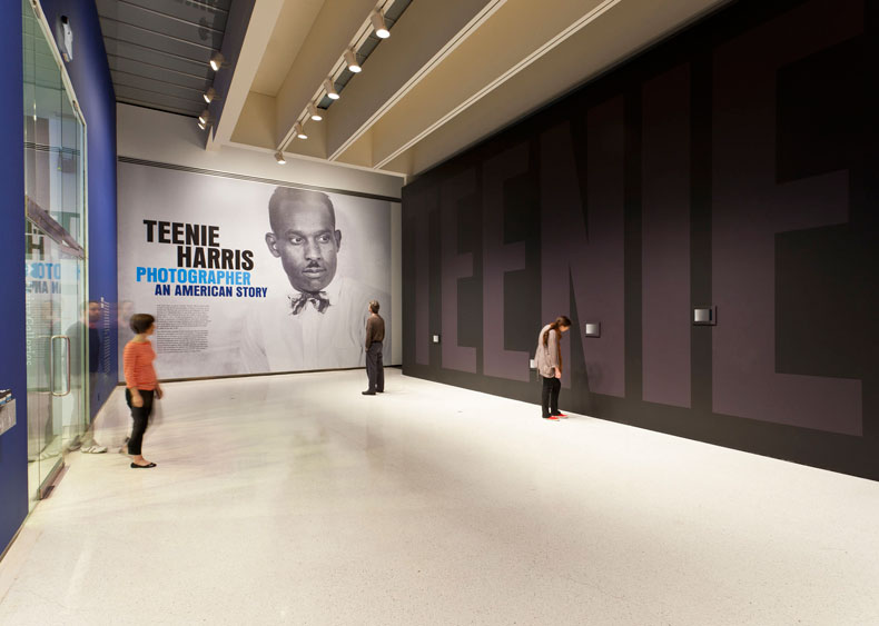
Last year I was working on three shows at the Carnegie but they all had different opening dates and there was maybe a two-week period when all three were up at the same time. But this never really dawned on me. So we were at the museum with my wife’s family and I was in the Heinz Architectural Center looking at the Maya Lin show I had done the design for. I walked out the door of HAC and right into the Teenie Harris show that I worked on (with a bunch of great people including the architect Paul Rosenblatt) in the large gallery spaces upstairs. And then I walked out of that, and as I was coming down the long stairway, I could see the show I worked on in the Forum gallery. This might sound like “who cares?” but it was the first time I realized that I had done the design for every show that the Carnegie had going at that time.
I remember just stopping there on the stairs and thinking A) I’m a pretty fortunate guy B) I really love my job and C) I need to enjoy this because it will never happen again.
 INSIDE THE TEENIE HARRIS EXHIBITION.
The second story took place something like 15 years ago. I had just started working at Wall-to-Wall Studios. We had City Paper as a client and we did their covers each week. Each designer took turns doing one and my turn brought “The Smell Issue.”
I did this illustration of a giant nose with hands and feet holding a copy of the City Paper with the cover I designed on it. So it was that old trick with the cover of the cover of the cover and it just repeats until it gets so small you can’t see it. Anyway, I was so proud of this cover. It was one of the first things I ever did that I truly loved. No one else thought it was that special but I loved it.
One day I was in the South Side with my girlfriend (now wife) for one of those sidewalk festivals. And in the distance, lying on a table, I could see my cover. This warm rush came over me. I was so damn proud of that cover and I kept my eyes fixed on it as we got closer and closer to the table. I even started fantasizing about how I would tell the person at the table that I had designed it and they’d be so thrilled that they’d ask me to autograph it. Clearly I was nuts.
But anyway, we got closer and closer to my cover and I had my eyes locked on it, not noticing anything else. Just as we got up next to it — SPLOSH! — all this crap comes down on it, completely covering the wonderful nose-man I had created. Someone had put the paper under their pet bird which was on a perch on the table — and I never saw it because I was so focused on my cover. My work was there to gather up any crap the bird might make. And it made some at the perfect time.
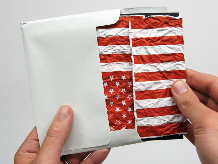
 From “For Everything I’ve Done and For Everything I’ll Do”.

How does your process change when you go from working for a client to approaching a personal project like Channel 52?
It’s amazing to me how many opportunities I’ve been given to make “art.” Because I’m clearly not an artist. My mind just doesn’t work the way an artist’s mind works. And I can’t self-create. No matter how hard I try. As with design, I need to be given an assignment in order to start.
With Channel 52 or any of the “art-like” things I’ve done, it comes from a phone call or an email with someone saying: “I’m curating this show about ‘X’ and I’d like you to be in it.” There’s a theme and a deadline and then I feel like I can get started. So it’s really similar to how my work starts as a designer — with someone I like (or think I’ll like) to work with, saying: “Here’s what I need and this is when I need it. Are you interested?”
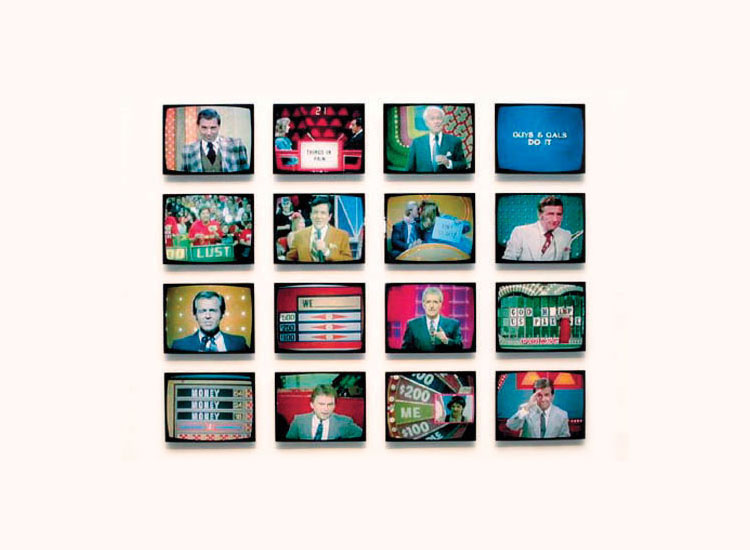
 CHANNEL 52.
When I work on these art things, I’m using the same tools I use as a graphic designer. So it almost always involves typography and paper in some way, and I’m usually answering a question or giving the audience a direction to follow. I think that’s a large part of why it’s never “great art,” which is more ambiguous or mysterious or subtle or open-ended or just completely out there. I just can’t find a way to make myself think like that. I always want to give the answer away. Or give it too much order. Or make it too clear. My designer mind, right?
Still, I put my “art” projects on my website, not because I’m incredibly proud of them but because I think they offer an interesting contrast to my design work. Everything in the “art” genre on my site just cries out “failure” to me. And I kind of like seeing it — and more importantly, want other people to see it — mixed in with my “real” work. Because I think it tells a pretty decent story of who I am, creatively speaking.
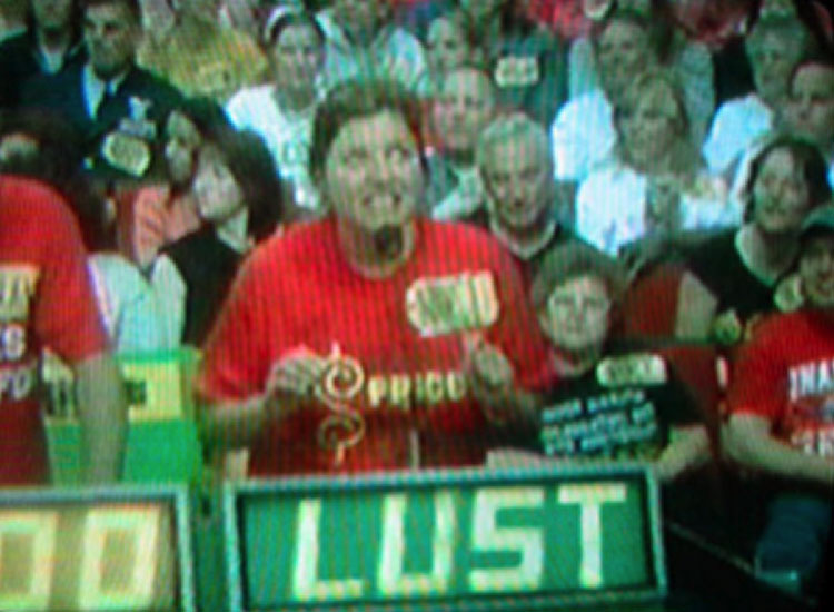
 A STILL FROM CHANNEL 52.
What is the science of effective design? What are some amateur pitfalls?
I really don’t think there is a “science” to it. And I doubt over and over again if it can even be taught. I feel like a good part of it is innate and an effective education can help bring it out and nurture it and even give you discipline for it. But I don’t know if you can actually “teach” someone to be a graphic designer if they’re not starting with some degree of God-given talent. Plus, there are some great designers out there who have never even gone to design school. Never even taken a design class. And “amateur pitfalls” can be terrific sometimes. Not knowing what the “rules” are and not knowing what you’re doing can sometimes lead to the most amazing work you’ve ever seen. Tibor Kalman is a good example of that.
That being said, there is clearly a strategy, a line of thought, going into your work. What was it for Conflict Kitchen? You were asked to design the facade of a take-out restaurant/conceptual art piece that only serves cuisine from countries with which the United States is in conflict. How did you land on bright, repetitive patterns, instead of say, images of leaders from that country?
For the first one, we didn’t want it to scream “Iran.” Yes, it’s a public art project but it’s also a take-out restaurant. If it looked too over-the-top, people might not feel comfortable purchasing food from it. Still, we wanted people to stop and notice it. We lucked out with Pablo Garcia’s great idea for the structure — this thing that was completely flat against the building and then had pieces that could pop out to give it some dimension. So we had to come up with something that could work with the facade, be switched out completely after a few months when we represented a new country, and be done fairly cheaply.
 MATERIALIZING CONFLICT KITCHEN.
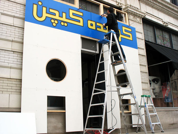
Color and pattern seemed the best way to go. We researched the colors, textures, and patterns of Iranian architecture, and did a bunch of GoogleImage searches. The “hip” farsi typeface for the sign made you want to look at it, even if you didn’t know exactly what it was saying. And the smaller, plexi circles (which were lit from behind at night) gave you the translation. Then it was just a matter of designating what pattern or color could go where and translating that to paint and adhesive paper.
The thing I’ll always remember is when it was finished, we walked across the street to look at it. Jon was holding a printout of my Photoshop sketch and it looked almost exactly like it did in real life — because the facade was so darn flat and the colors and patterns were so crisp and precise.
 CONFLICT KITCHEN IN PITTSBURGH’S NEIGHBORHOOD OF EAST LIBERTY.
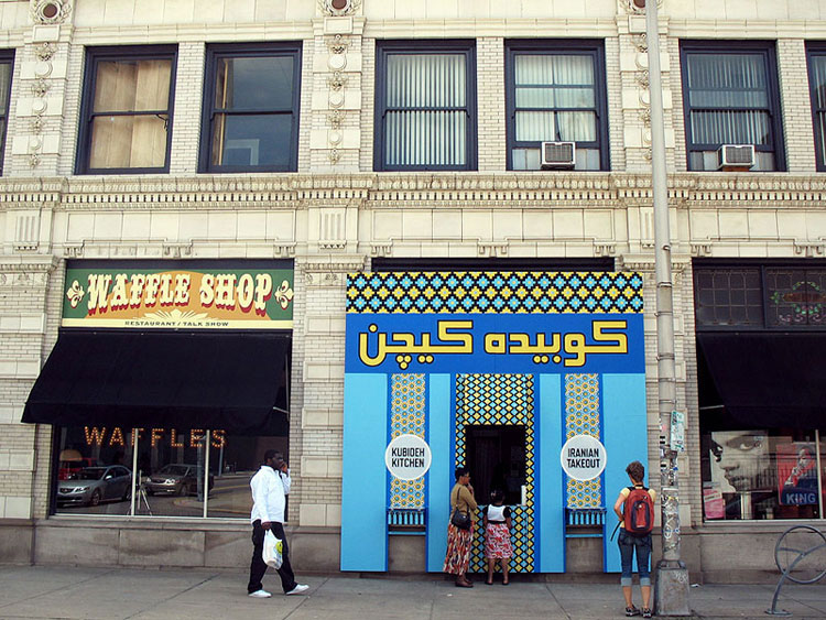
The biggest challenge for me was that once it took off and Jon and Dawn wanted to do more countries, I had to come up with treatments that were individual to each country, but also, kept to the overall theme of Conflict Kitchen. And after a few of them it got harder and harder to do something that looked interesting. But it’s been great to work on. So many people have gone to it and talked about it. When it starts up again, one of the countries we plan to do is North Korea. I’m looking forward to that.
Do you think it’s important for art to be in conversation with politics?
For sure, but in a way that goes beyond preaching — either to the choir or to the unconverted. Work like that always feels heavy-handed and false to me. I think you can find politics in just about anything if you look hard enough. But when an artist or designer consciously wants to go there, it requires real skill to keep it out of the realm of “this is my viewpoint and I think you should agree with me.”
I think the most effective “political art” gives the audience something to think about — puts something out there — but doesn’t try to steer them one way or another in an overt way. Of course I’m biased, but I think my friend Jon Rubin does this really well. Jonathan Horowitz is also really great at it. From a graphic design standpoint, there are some real masters — James Victore comes to my mind immediately, though he doesn’t do as much lately as I wish he would. But yeah, when it’s done right, it can be incredibly powerful and I believe it can make a person see things in a way that they might never have been able to otherwise.
The work I’ve done in that area is not something I think is all that great. Again, I only do it when I’m asked. As with art, I can’t self-initiate that kind of thing. When I’m asked to do it I try to think of it in terms of what would I look at more than once? Or hang on my wall? Or email to someone? What message can I create that would resonate with me? I don’t know. I think making an amazing political poster — something that stops someone in their tracks but doesn’t feel preachy or patronizing — is one of the hardest things for a graphic designer to do. But also maybe one of the most important things a graphic designer can do.

FROM “30 REASONS”, A PROJECT IN SUPPORT OF OBAMA’S RE-ELECTION.
From being in a dialogue with artists at CMoA and MASS MoCA, who are at the height of their careers, to young, student artists at CMU, have you formed an impression about how our society’s current health care system impacts the artist demographic?
I know a few local artists, writers, designers, etc. who are just starting out or struggling to find a job or don’t want a nine-to-five gig because they need that time to make their work. And they’re either going without healthcare or paying a large part of what they make towards it. I really hope that with this latest election and with the way Obamacare is structured, these peoples’ situations will improve. Not just “creative people” but anyone working a low-paying job whose employer won’t give them coverage. Or someone who’s already sick and can’t get coverage and has to pay for care out of their pocket or go into debt over it. Things like healthcare and unemployment, I never think of in terms of how they affect a certain group of people. It’s affecting so many people. All over the map. And it’s heartbreaking that it’s happening in a country as prosperous and powerful as this one.
 A GOOD WAR IS HARD TO FIND. BOOK TWO IN THE “A BOOK A YEAR” SERIES.
What would you like to see from the US health care system in the future?
I want to see Obamacare keep moving forward and evolving. That’s one of the reasons why this last election was so darn important. Obamacare is not perfect, but it’s a start in the right direction. No one should have to suffer a deep financial burden because they get sick or someone in their family gets sick. No one should be denied coverage for a pre-exisiting condition. No one should be discouraged from getting physicals and screenings that can help keep them healthy just because they can’t afford it.
The thing I thought was interesting about the Republican argument against Obamacare wasn’t that it was going to hurt people or that people shouldn’t HAVE healthcare. Their two main objections were: “We just can’t afford it. It will add to the deficit.” And “It’s government forcing itself on the people.” That’s just poppycock. Our government has always found a way to “afford” a war or a tax cut, and most people are pretty fond of their Social Security and Medicare.
I think that Obama winning this last election will give it some time to grab hold and evolve so they can figure out what’s working and what can be improved upon, rather than throwing it out altogether like Romney promised to do. Some red states will probably reject it as much as they legally can. And that’s OK. Because I think people will see how good it becomes in the states that do accept it fully. Just like how almost everyone seems to dig universal healthcare in Massachusetts right now.
I really think that, given time, it will prove to be one of those things that people several years from now will look back on and say: “Man, what took our government so long to do that?”
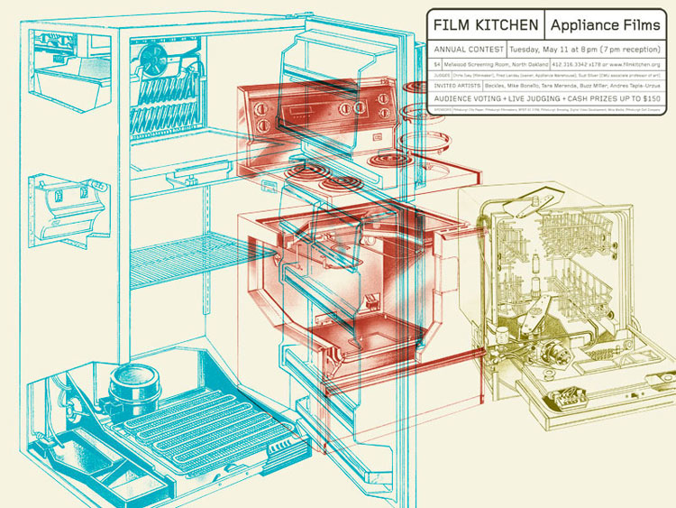
 POSTER FOR FILM KITCHEN, A PITTSBURGH FILM SERIES.
Twenty Pittsburgh artists are in the process of designing an image around our documentary series for the upcoming Healthy Artists Movie Poster Exhibition. The winning design will become the official representation of the series. As one of the judges of the exhibition, do you have any advice for the artists?
My advice would be what I usually tell my students when they’re doing this kind of project: Do it for you. Don’t worry about who your audience is or what you think someone else is going to like. If you like it, if it makes you feel good when you look at it, well then, it’s gold. And if it doesn’t exactly work out as well as you would have liked, there will always be another opportunity to try again.
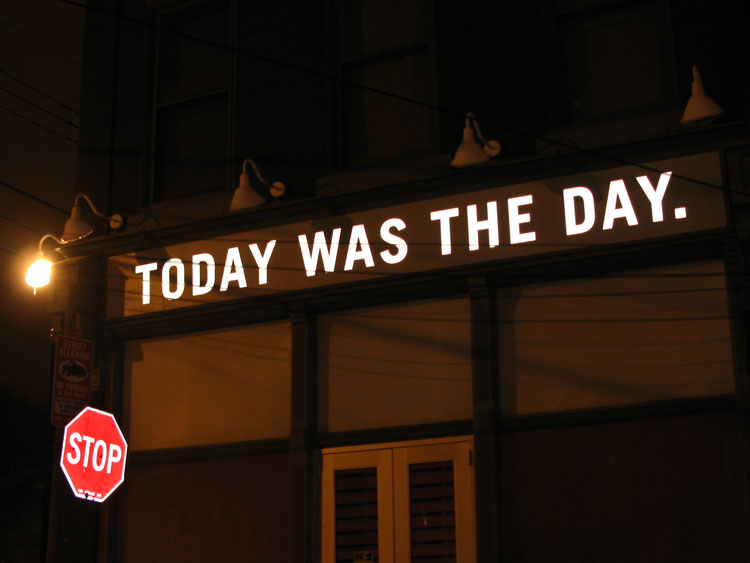
 THE DAY WAS TODAY. A PIECE FOR GESTURES AT THE MATTRESS FACTORY.
Learn more about Brett Yasko and his work at www.brettyasko.com
Stay tuned for the Healthy Artists Movie Poster Exhibition.


One Pingback